SET
UI/UX Designer
SET is a prototype design for a mobile app aimed at helping users manage procrastination while enhancing their study habits. The app focuses on creating a structured yet flexible environment for users to organize their tasks, set goals, and track their progress through engaging features. My role involved developing the user interface and user experience using ADobe XD to create an intuitive prototype.
the problem
Many students and professionals struggle with procrastination, leading to decreased productivity and increased stress. SET aims to provide a solution by combining study tools with motivational features that encourage users to stay focused and manage their time effectively.
my role
As the UI/UX designer, I was responsible for the entire design process of the app, from conceptualizing user flows to creating high-fidelity prototypes in AdobeXD. My goal was to design an app that is both visually appealing and easy to navigate, promoting an engaging user experience.
timeline
Feb - April 2023
role
UI/UX Designer
tools
AdobeXD
user requirement gathering
Initial survey responses (n=11) revealed that the primary goals users sought to achieve through similar applications were task checklists, accessibility, and a method to prevent distractions.
These concerns aligned with my previous research findings:
Many users reported feeling overwhelmed by apps that had too many features crammed into one interface. This led to confusion and disengagement, as users struggled to find the tools they needed quickly.
Some apps offered limited options for personalization, making it challenging for users to tailor their experience to fit their individual study habits and preferences.
A common complaint was that existing apps did not provide enough motivational support. Users wanted more engaging elements, such as reminders or rewards, to help them stay focused and combat procrastination effectively.
ideation, design, prototype
There were two main areas of focus for the design of SET: a simple and intuitive design and the application itself.
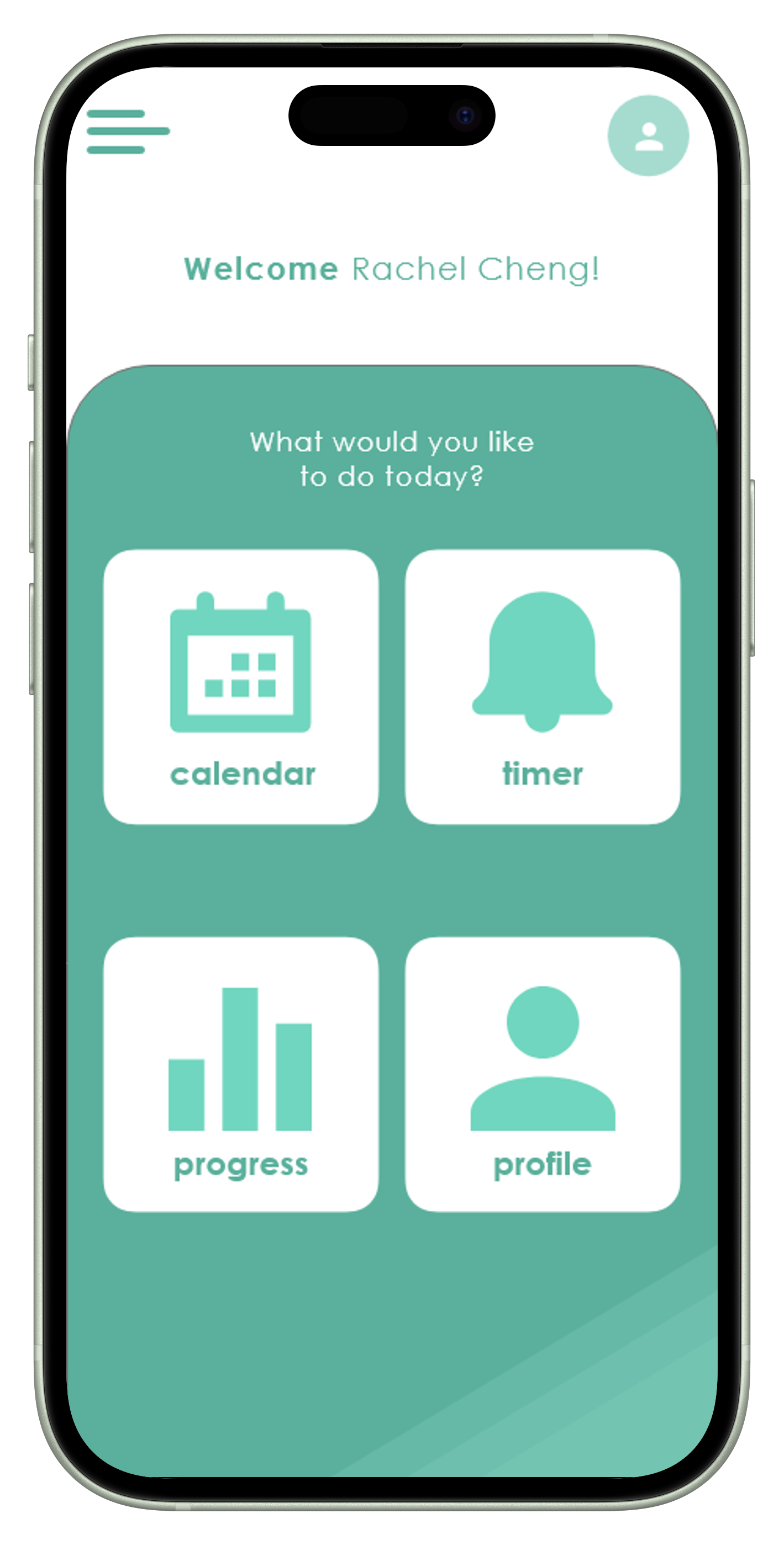
My goal for SET was to create a balance between the tone and design of the app to avoid an overwhelming interface. I opted to incorporate simple icons and amble ‘white’ space to enhance the user experience and ensure that the content was easily navigable and manageable.
I employed a calming color palette of monochromatic green to reduce anxiety and promote focus. The typography was selected for clarity and legibility, ensuring that users could easily read tasks and instructions. I also included motivational elements like progress bars and achievement badges to encourage users to stay engaged and make the study process more rewarding.
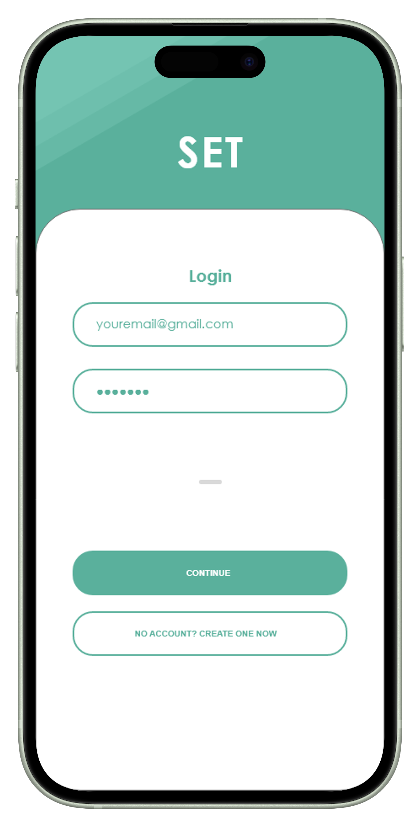
Login Page
Calendar/Assignment Input
Study Timer Option
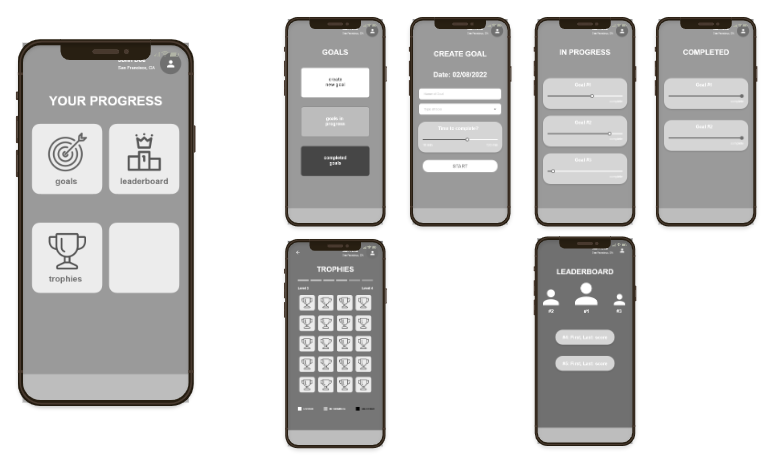
Goals/Trophies/Leaderboard
Reflection
This project deepened my understanding of user-centered design principles and the importance of balancing functionality with visual appeal. I learned that engaging users through motivation and reward systems can significantly enhance their experience. In future projects, I aim to integrate more extensive user testing to refine features based on direct feedback. Additionally, I want to explore how different design styles can influence user engagement, diversifying my approach to create unique experiences for different applications.
Time was a constraint on this project as it was for a course, but if I were to continue working on this project, I would conduct a second phase of usability testing to validate the updates made to the original design. While the changes were minor, obtaining concrete data showcasing improvements in task completion time and success rates would be valuable.
Nonetheless, I thoroughly enjoyed the opportunity to showcase my design and research skills. This project allowed me to work on my first app prototype while combining research and design, reaffirming my passion for the field.


